How does space shape our human experience? This question was a driving inspiration in the design of our Autumn 2023 issue, FRAME 153.
This issue of FRAME makes me think of George Perec’s 1974 book Species of Spaces and other Pieces. Perec was a French writer known for his exploration of everyday life and the minutiae of our surroundings. In Species of Spaces, he encourages readers to take a closer look at the seemingly mundane elements of our environment and contemplate their significance. In a similar vein we showcase in FRAME 153 spaces that go beyond mere functionality and aesthetics. They seek to merge with the human experience, prompting us to interact with our surroundings in meaningful ways.
Perec didn’t ‘just’ write the book, he played with the formal aspects of writing and page layout to enhance the reading experience. Experimentation with layout, typography, and other visual elements can add an extra layer of meaning to the text and engage readers in a unique way. We wanted to bring a bit of playfulness to this magazine, too, trying different colour overlays, gradients and uses of typography. As with the previous issue, we chose an additional typeface to represent this issue’s theme. Our first thoughts circulated around ‘feel good’ typefaces but nothing felt quite right, so we continued our search while getting more familiar with the content of the magazine.
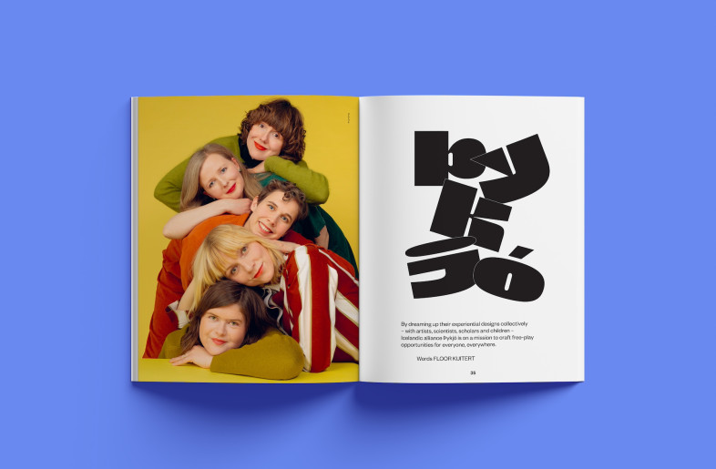
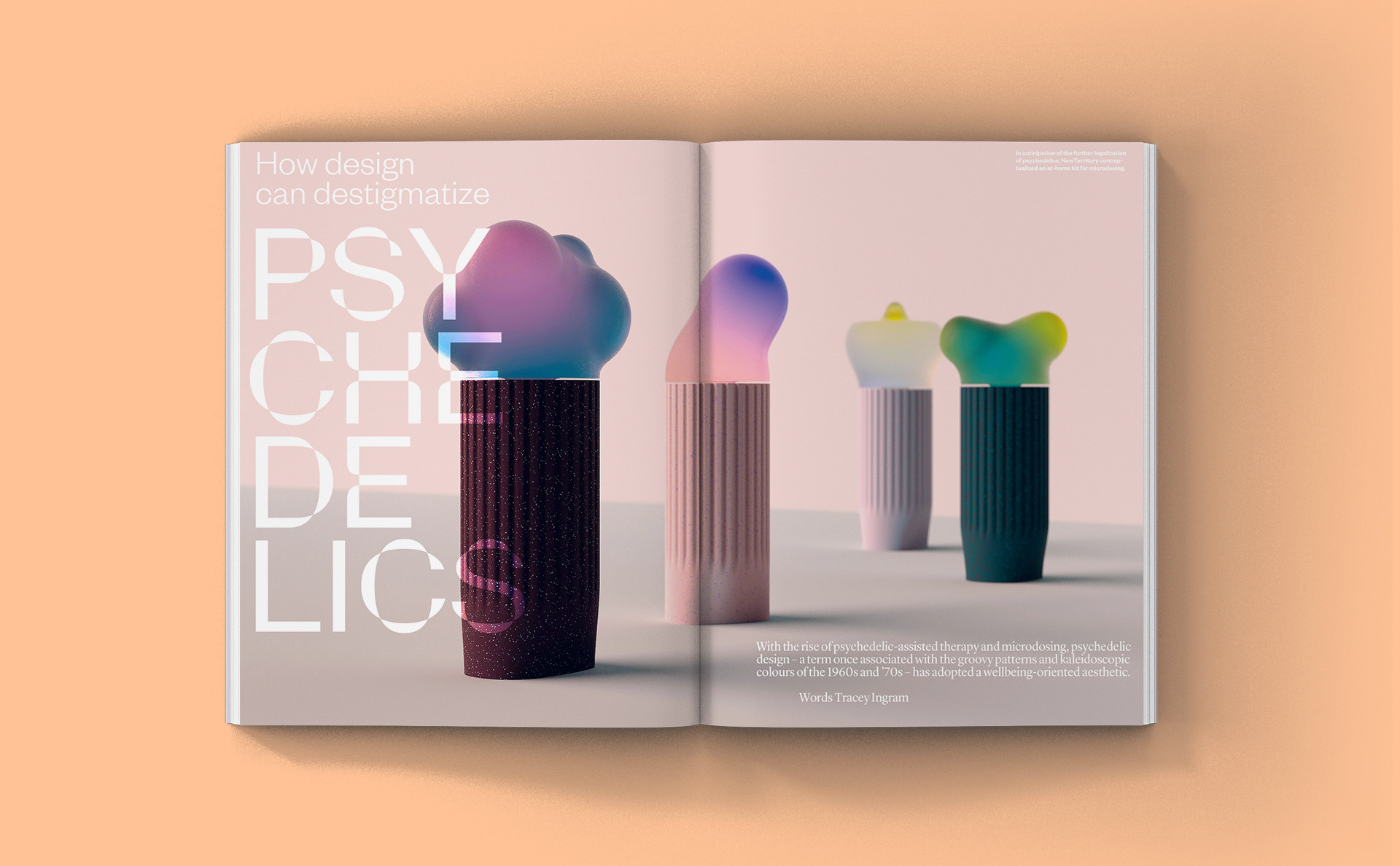
The piece about design as a gateway to destigmatize psychedelics by editor at large Tracey Ingram brought lots of visual ideas, touching on future-forward technologies, regenerative materials and a ‘curious’ approach to design. With this abstract but very inspiring direction we discovered Parabole. The Parabole typeface was designed by David Molnar in 2019. Its Display cut was constructed by flipping the counters and stems of the characters resulting in an inside-out effect. Each letter can be drawn with one continuous line, creating a captivating pixelated look in small sizes and a seamless, multilayered appearance in larger sizes. The characters are geometrical and organic at the same time, particularly when used large-scale. The design of the font allowed us to use it in various ways: full colour, semitranslucent, overlayed on images and as an outline, where you can clearly see the infinite line of each character.
Both Perec's work and FRAME’s design strategy invite us to be more mindful of our physical environment, and recognize how it shapes our thoughts, emotions, and interactions. By doing so, we can gain a deeper appreciation for the impact of design and architecture on our lives and the intricate relationship between spaces and human beings.
P.S.: We made the magazine less heavy using a more porous uncoated paper. It is easier to carry and ‘lighter’ on the environment.
Barbara Iwanicka, FRAME's design director, is a Polish art director and graphic designer. She moved to Amsterdam to attend the Gerrit Rietveld Academy. Before joining FRAME, she worked as a drama teacher – an early outlet for her passion for storytelling. Barbara’s designs stimulate the dialogue between content and form, making her a natural fit for a platform that does the same. Her work has been awarded the ‘Best Dutch Book Designs’ and AIGA 50 Books.
Get your copy of FRAME 153 here.